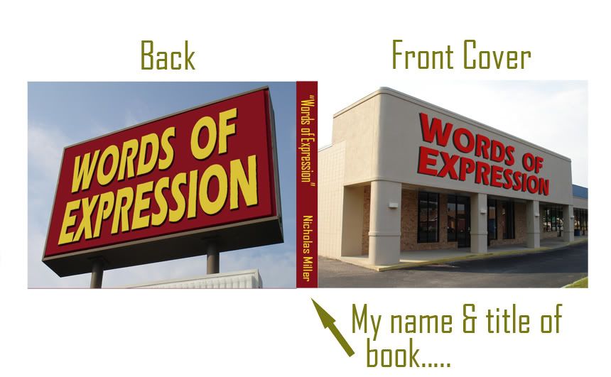
*Front and Back Cover of Book
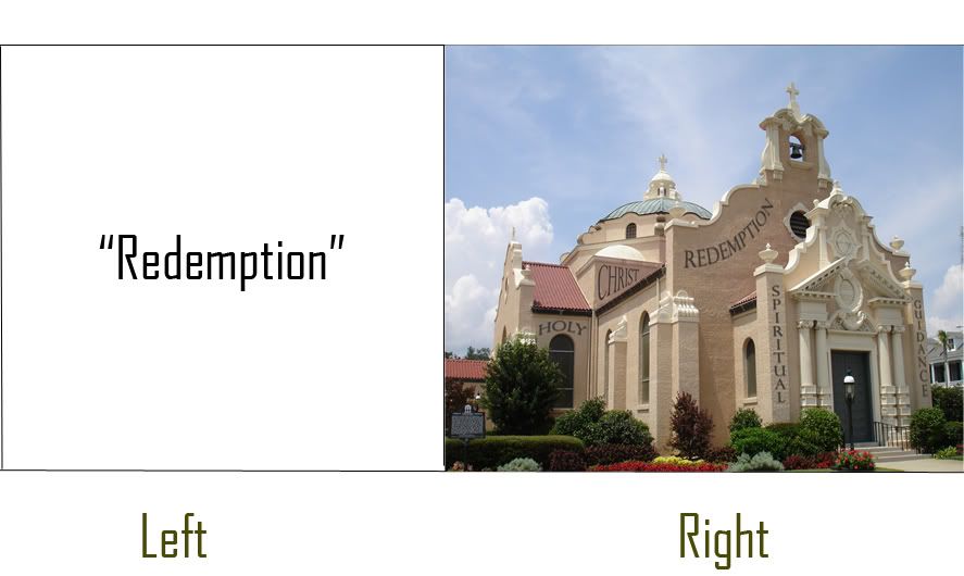
*How the pages of the book will basically look.
I am using Blurb to create my artists book. I will put my artist statement along with the title and my name on the first page of my artist book. The size of my book is going to be a large landscape size book and is going to measure 13 x 11. I have it set as a hardcover book with a dust jacket. The size of each picture will be 12 x 9.5 and only the Front and Back covers will be set as full bleed.
*Front and Back Cover of Book
*How the pages of the book will basically look.
I'm glad that you decided to put your name and the title on the spine of the book. I also like the font you choose for your text in the book.
ReplyDeleteThe covers look great and I also like that you have your name and title on the spine. The images look awesome.
ReplyDelete-Sarah
Looks good! I like the picture of the church!!
ReplyDeleteThe new photos are great! I'm really liking the layout & the cover! I can't wait to see the final product! :D
ReplyDeletethe cover looks better
ReplyDeletethe title on the spine works real well. I cant wait to see the finished project.
ReplyDeleteNick! Your latest contributions are great. Every one is making a statement. I wonder if the back cover would look better if you used a photo with a different caption. It seems to compete with the front cover and the spine. I can't wait to see what else you do!
ReplyDeleteElaine