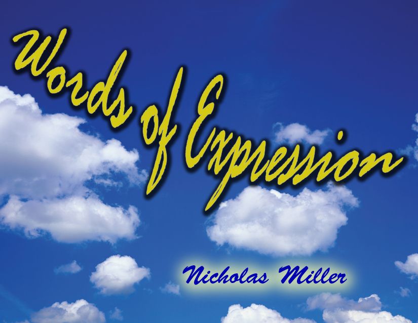
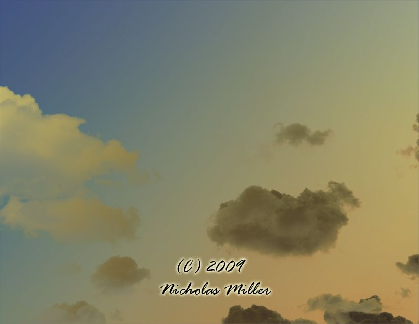
Front Cover
Back Cover
I am using Blurb to create my artists book. I will put my artist statement along with the title and my name on the first page of my artist book. The size of my book is going to be a large landscape size book and is going to measure 13 x 11. I have it set as a hardcover book with a dust jacket. The size of each picture will be 12 x 9.5 and only the Front and Back covers will be set as full bleed.
I think your front and back covers could be a little stronger. You are going in the right direction and your new photos look great! Right now the front cover has the feel of a poster and doesn't exactly convey what the viewer will see when they open the book.
ReplyDelete-Sarah Whitfield
Your new photos you did last week are the images for the book, you hit the nail on the head. Maybe for the title take a photograph of a billboard and put your title on it or something on that.
ReplyDeleteI agree, I think using the front and back cover as an extension of what's inside the book will be a lot stronger than just having text floating on images.
ReplyDeletemhmm i agree with the above statements.
ReplyDeleteyou dont need your name and copyright on the back though. "artist books" are different from "book" books. think outside the book. or box. or book box.
I'm not sure why you're choosing a sky as the background of the front and back cover? Most of your pictures have the sky in them but in two of them you can hardly see it. Just wondering what the reasoning was.
ReplyDeleteI don't think the name on both sides is needed either. I do also agree with sky about photographing something and fonting your title in. The Waffle House photo is the best and keep on moving in that direction.
ReplyDeletethe new images for the book are definitely the strongest so far. i think if you used a photo that is more similar to those would work better as all of the images for the book involve some kind of architecture in it and the covers are just of the sky.
ReplyDeleteThe front and back cover dosen't have the relationship. it just looks like the just picture not a cover. what about the changing the color of your title texture with the blue as you did on the name.
ReplyDeleteI really like the new photos you added! I think that the cover could be a lot stronger, and I agree about maybe taking a poster or billboard & adding your book title on it. I would also maybe shorten the statement a little bit. But besides that you are definetely going in the right direction! Keep up with the great work! :D
ReplyDeleteYour work is progressively getting better. Your text is blending into your buildings better, it looks great. Solid ideas for your back and front covers.
ReplyDeleteI'm not sure if the cover of the book is quite there yet. I would like to see the text look more natural as if it is part of the clouds. The last two pictures that you have taken are a couple of the strongest ones you have. You are deffinately progressing with your idea.
ReplyDeleteDanielle
Wow, I love your new images! This is exactly what I had in mind. The covers leave me bored and not anxious to look inside. But, I think something neutral is a good idea because businesses may question you using their trademarks on the cover.
ReplyDeleteKeep it up!
Elaine
As everyone says above in one way or another, your cover does not convey the content of the book in a visual way and it should.
ReplyDeleteWe also need to work on the statement as it is too descriptive of the images, and some of the images "tell" a bit too much instead of "showing us" (this is the problem of adding text--eek!). Make the statement more about the idea and less about what the images show.
Make the images show us more instead of telling us. Does this make sense?
You are getting there, I know I am asking for a lot of work but it will make your life easier when it is time to edit down for the book. Hang in there! You are so close!
xoxo
VAL
i really really like the waffle house pic! i like ur pic for the front but i would love to see a more stronger composition with text and photo like in some of ur previous pics.
ReplyDelete