I may also decide to eliminate the solid color as my back cover. I'm thinking of using one of the photos below as my front cover and another one of the three photos below as a back cover instead of just a solid color. For the back cover I will eliminate my name from the photo.
1st Front Cover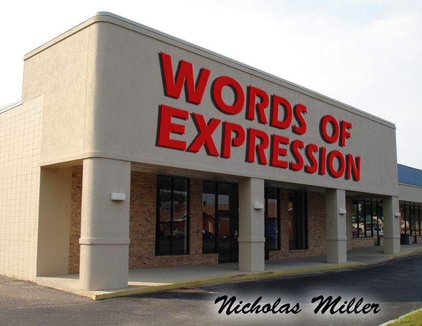
2nd Front Cover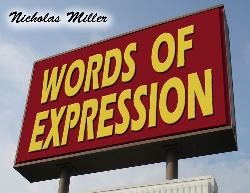
3rd Front Cover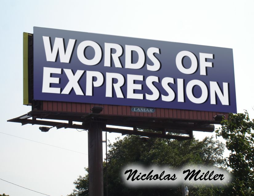
Back Cover - Solid color for all three front covers.
These are much stronger. My favorite is the first one. I think you should probably stick to a solid color for the back. Keep up the good work!
ReplyDelete-Sarah
this is good work. but i don't know about your name did for photo. i feel like you need to change somthing for the name in your photo. maybe. the location , the color? i am not sure. asking it to profesor!
ReplyDeleteyeah id go with one of the top two. definitely look for a stronger/better font for your name tho. also, maybe go a bit easier on the drop shadows. also, i didnt say it last time, but, good job on the hospital photo text, it blends well.
ReplyDeleteI like these a lot better! I'm not too crazy on the glow filter you used for your name. I'm not sure it's necessary. I think eliminating that or your name from the cover will make it so much stronger.
ReplyDeleteThe second one seems the strongest to me. It looks good. I agree with that you should look into a different font for your name if you decide to keep it on the cover... but maybe you should save your name for the inside page?
ReplyDeleteI like the second the best. If you used this a solid black, not blue might work better.
ReplyDeleteI think the glow and size of your name can be played with a bit more. Overall, I think it's really looking great.
Way stronger!
ReplyDeleteI think since the name is distracting everyone, I vote to take it off the cover, we can always put it inside. Even if you choose to not include a statement, and maybe in your case the images can speak for themselves.
You could write someplace on the inside of the back cover in the lower right corner--- All artwork by Nick or something like it.
These photos are very strong. They are uncluttered, clean, direct and eerily quiet.I would encourage you to keep finding this kind of atmosphere!
That's my vote!
x,
v
i really like the photos of the signs and think one of those should be ur cover. i also agree that ur name shouldnt be on the front. good locations on ur new pics, keep going!
ReplyDeleteI like the lamar sign as your cover.
ReplyDeleteThe third photo is the most successful to me. I agree too that the name is distracting from the rest of the image. You can always put your name on the back cover instead, that might work better.
ReplyDeleteDanielle
Definitely a fan of the first image for your cover. Your title is great, it compliments your photos with just enough information to convey your idea. Glad to see its coming together.
ReplyDeletethese are working much better for cover idea. although now with your title on a billboard it kind of reminds me of religious billboards. but i think that these are a lot stronger.
ReplyDeleteI choose the second and third sign photos. They seem more realistic with your goal. Your name on the front cover is distracting, and commands attention away from the title. You can always place the title and your name on the spine.
ReplyDeleteKeep going!
Elaine
These covers are great! I think I like the sign and the billboard best! I cant wait to see more! Keep up the great work! :D
ReplyDeleteMuch better with blending the words in with the picture! I really like the one of the hospital! For your cover my favorite would have to be the second one. I think it works better with the rest of your photos.
ReplyDelete